Welcome to the third installment of a 4-part blog series about search engine optimization (SEO) and its interconnectivity with accessibility ('A11Y' - because there are eleven characters between the 'A' and the 'Y'). With this series, Patrick Hathaway from Sitebulb and Matthew Luken from Deque Systems will each write complementary articles on the subject from their unique points of view.
In this series so far, we have demonstrated why accessibility, as a facet of UX, should be something that SEOs care about. We've also explained how the two disciplines are symbiotic in nature, and shown how the technology used to consume web content for search engines is very similar to the functionality of assistive technology like screen readers.
One of the central arguments we've used is that 'improving accessibility often also improves SEO, and vice versa.' In this post we will tackle this head on, covering specific areas of optimization that legitimately benefit both practices.
The article will cover why each section is important for each discipline, and how to think about them from an optimization standpoint. As always, I will be writing from an SEO-first perspective, and Matthew's take will be accessibility-first.
Introduction
Matthew and I have selected these areas based on a broad-strokes approach. While they cover the lion's share of opportunities, they aren't an exhaustive list. The presentation order organically formed as we planned out this blog post. You might find your digital product or practice should address them in a different order.
Table of contents
- Title tags & meta descriptions
- Content
- Navigation
- Anchor text
- Image alt text
- Sitemaps…and breadcrumbs
- Structured data
- Summary
Title tags & meta descriptions
Patrick says…
Your title tag and meta description are two of the most important on-page elements, not least because they function as the most visible elements for most search results:

It has long been known, and remains true to this day, that title tags are a ranking factor - which means that, for a given search query, the title tag will be considered when deciding how relevant a particular web page is as a result for that query. In terms of optimization, it is a good idea to include target keywords in your title tag, and you absolutely want to make sure that the title is relevant to what the page is about.
Although meta descriptions are not a direct ranking factor, they show so prominently in the search results that optimizing them is considered best practice for on-page SEO. They exist to give the searcher an idea of what content to expect on the page, and so well written meta descriptions can have an impact on click-through rate (CTR), which can positively affect a page's ability to rank.
Matthew says…
Page titles appear in the browser tab along with the site's favicon (the website icon in the left-most position of the tab). This is the first thing the visual user sees and the first thing read to a screen reader user when they land on the webpage.
The viewable area of tabs is flexible and shrinks as users open more tabs in their single browser. While the viewable number of characters shrinks for the sighted user, the full page title is read aloud to the screen reader user. Designers need to think about the first few words (for visual appeal) and the full title for when it's read aloud by a screen reader.
Page titles are very important for screen reader users because many user journeys are nonlinear – where they land on a specific page within a website as a result of clicking a search engine result. When that page opens, the screen reader user will hear the page title read out, telling them that they've arrived at their intended page.
Meta (or page) descriptions are also read aloud by screen readers. The objective is to help the user understand what the page is about. Therefore, these descriptions need to be accurate, clear and representative.
Page titles and meta descriptions form the foundational understanding of the page's content and what to expect from the experience. This is true whether consumed on-page or via search results (linear and nonlinear) and so, the descriptions must be the same in both places. Either way, it's critical to correctly and consistently set these foundational elements.
By the way, Neurodiverse users also rely on unique and easy to understand page titles to help them quickly navigate to the correct content, especially when there are multiple tabs open at once. People are described as neurodiverse when their thought patterns, behaviors, or learning styles fall outside of what is considered 'normal,' or neurotypical. Autism is an example of neurodiversity.
With these concepts established, let's define more deeply how to accomplish them:
- Use meaningful page titles appropriate to the context of the page. Use clear, understandable, and descriptive language that helps the user understand the page content they are about to consume.
- Keep page titles less than 60 characters in length. Avoid sensational, inaccurate, and 'click-bait' titles.
- Meta descriptions should be just long enough to be descriptive; they should not exceed 160 characters. Do not stuff them with keywords and don't use buzzwords.
- Read WCAG Success Criterion 2.4.2 to learn more about page titling. Users should be able to understand a page's purpose without having to read the content on the page.
- Writers, content specialists, UX designers, product owners, and SEO experts should work collaboratively on page titles and meta descriptions.
Section summary
If you only ever did one piece of on-page optimization, title tags are arguably the most important - they form a basis of understanding for users and search engines alike, and play an important role when consumed by screen reader users. When it comes to SEO, sometimes meta descriptions get ignored and left empty, as Google have become competent at writing (or re-writing) them - but knowing that screen readers will also read out a meta description should encourage a more mindful and conscientious attitude to writing them.
Content
Patrick says…
'Content is king.' So goes the ancient SEO proverb, which still retains a level of credibility despite today's machine-learning and AI fueled landscape.
If we were to re-write this based on today's prevailing advice, it would probably read 'the right content is king.'
These days, we are encouraged to consider the searcher intent, and perhaps more importantly - how Google understands the searcher intent. As in, for a given search phrase, what do they think the user is looking for?
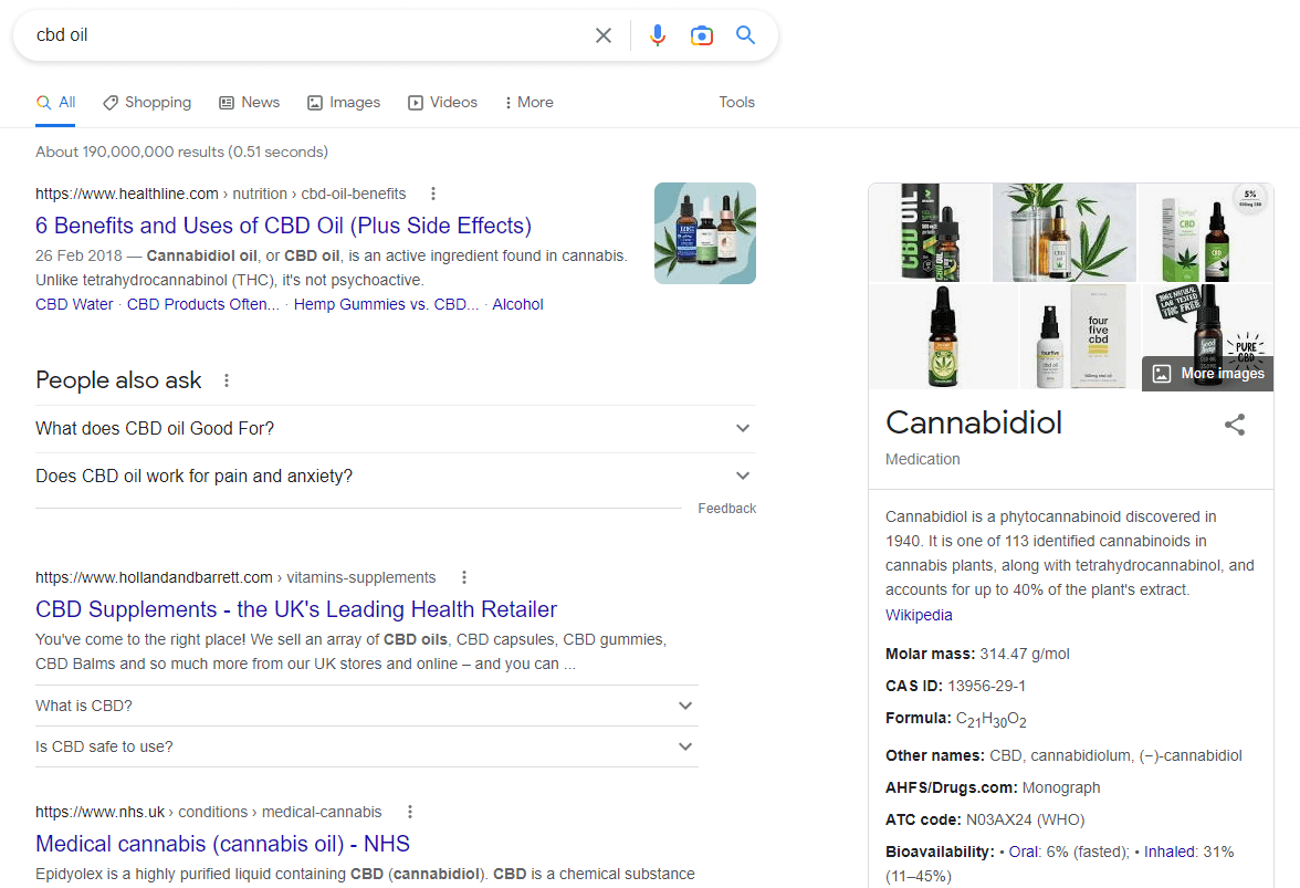
You can see how this changes for different search queries by analysing the SERPs, for example a query like 'cbd oil' returns informational results and a knowledge panel on the right - indicating that Google thinks users are performing research. Since the second organic result is actually a commercial result, you could also argue that Google do not understand the intent to be completely clear.
Tweak this search phrase ever so slightly, and the context shifts. For 'cbd oil uk,' the knowledge panel disappears and the results are only commercial, indicating that they are more sure that this is a transactional query.
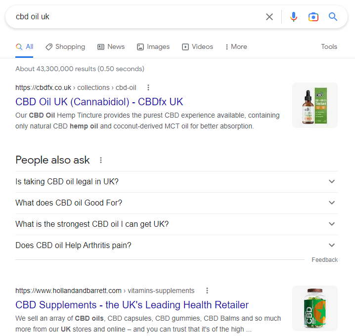
Focusing on search intent allows you to optimise content in a way that aligns with Google's goal: to serve web pages that reflect what the user was looking for.
Beyond the intent of the query, you can also analyse the search results in order to understand what type of content is being rewarded in terms of rankings.
For example, do the top ranking pages include;
- Videos
- Maps
- Lists
- Lots of textual content
- Question/answer content
- Definitions
- Tables
- Graphs
- Etc…
This sort of analysis can inform how you approach your own content strategy, and what content types you plan to include. This is a particularly important strategy if you are optimizing for featured snippets.
Matthew says…
Users expect your content to be to-the-point, understandable, clear, digestible, relevant, and most importantly what they need – not what you want them to have. That's a very difficult deliverable when you have millions of unique visitors, each with their own needs, expectations and desired outcomes.
Content is a very broad subject and, as the saying goes, it is "King." Let's focus on three key aspects of text content that have direct relationships between accessibility and SEO: lists, video & audio, and readability.
Lists
Lists group items together that are related to each other. Lists clearly but passively communicate the importance of this content. Use lists ordered with letters or numbers to suggest importance or sequence. Use unordered lists, with or without bullets, when the order or sequence does not matter.
This is not just about visual formatting. When coded properly via list markup, screen readers let the user know when there's a list on a web page, how many items are in the list, and then each list item. The user may then navigate through the list items or bypass them and move on.
Video & Audio
Video captions can be either open or closed. Open captions are always in view and cannot be turned off, whereas closed captions can be turned on and off by the viewer. Many users prefer to customize their viewing experience, so you may prioritize closed captioning. However, for accessibility, open captions would be the better option. Captioning benefits not only those that are deaf or hard of hearing, but also anyone in noisy environments like airports or sports stadiums. Closed captions help with understanding and learning, especially when the audio is not in a person's native language or users have cognitive difficulties. As a fun aside, search for articles about the buzz created by Season 4 of Netflix's 'Stranger Things' evocative captioning.
Audio Description (AD) is the verbal depiction of key visual elements in media and live productions. AD provides information on visual content that is essential to comprehending the program. It adds another dimension of context for blind and visually impaired consumers.
Basic transcripts are a text version of the speech and non-speech audio content. Transcripts don't just benefit people with sight and hearing problems. They help other users such as neurodiverse people. A transcript also enables search engines to ingest your multimedia content and index it accordingly.
Automated transcriptions are currently not fully accurate. They can capture the majority of the transcript, but until this technology is perfected, any automated transcription should be double checked for accuracy. Transcriptions that capture the dialog and provide descriptive narration provide a better experience overall. Transcripts also provide search engines with vast amounts of indexable text, boosting your keyword density and, more importantly, your keyword diversity.
Readability
Readability describes how easy something is to understand and reflects content quality. Simple language that is grammatically correct and with accurate spelling, friendly sentence structure, and jargon-free content affect readability and therefore accessibility. Also, a web page that has a ton of spelling and grammar errors is a poor quality signal for Google and will lower SEO.
Your readers have varying literacy levels. Maybe the content is in a language that is secondary to them. Maybe they have learning differences like dyslexia. As a team, define a reading level and consistently write to that defined level. Measure your content as part of your agile definition of done to ensure it's an included critical launch factor when releasing your website to production.
It's clear that content is at the core of SEO. The quality and mindfulness of your approach directly impacts accessibility for all users. Properly invest in making your content consumable by every possible user.
Some of the more important rules of thumb to keep in mind:
- Captioning is also referred to as subtitling.
- Audio Description is also referred to as description or video description.
- Transcripts should be linked adjacent to the video. Be consistent with the approach and style of the link. Remember that the link text needs to be understandable. The transcript should be launchable and downloadable.
A .txt file is the most accessible file format; PDFs can take considerable work to make accessible. - There is WCAG Success Criteria for Making Audio and Video Media Accessible. Check it out!
- Keep main content sentences short; preferably under 21 words. Keep line length to 120-170 characters; anything longer increases cognitive load to find the start of the text after the wrap. Left justify text as it is easier to find the starting point of the line.
- Recognize that common style guide rules change over time. Today many style guides have writers define acronyms and initialisms once and then never spell it out again. This practice puts a lot of cognitive load on neurodiverse readers. Consider using the fully spelled out series of words with the initials in parentheses each and every time, e.g., National Aeronautics and Space Administration (NASA) and Federal Bureau of Investigation (FBI.)
- Hashtags should be camel case (initial cap each word) for readability and understandability. Plus, no one wants to relive the trauma of the #SusanAlbumParty hashtag fail.
- Read and follow WCAG Success Criteria 3.1 to make text content readable and understandable.
- Writers, content specialists, video specialists, UX designers, product owners, and SEO experts should work collaboratively on content.
Section summary
Whether or not content is indeed king is moot - the fact remains that both search engines and assistive technology are (currently) best equipped to deal with text content, so it absolutely makes sense to focus on opportunities that allow you to provide more of it. Content optimization with an understanding of searcher intent will enable you to better align your content with what people are actually looking for, and what Google is looking to reward.
Navigation
Patrick says…
Navigation is one of the most important factors for on-site SEO, as it is the most scalable way of impacting the flow of internal link equity on a website. Because navigation is typically used across lots of pages, if a URL is linked to within a navigation section, it will inherit internal links from lots of pages at once.
There are a number of different types of navigation that may be used on a website;
- Header/top nav
- Footer
- Aside (e.g. sidebars or call out boxes)
- Related products
If you are looking to tweak internal linking practices in order to give certain pages a PageRank boost, using navigation links is typically quicker and easier than relying only on in-content links. For example, in our header navigation we call out a specific 'focus' page, which gives it an internal link boost.

In general, you need to strike a balance with navigation between UX and SEO considerations, finding ways to ensure that key pages are well-linked to, while avoiding an architecture with excessive click depth.
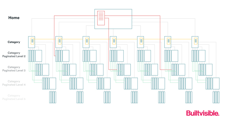
As Richard Baxter writes in his excellent guide to site architecture, ecommerce websites are highly prone to issues of PageRank dissipation through the use of paginated links to product pages.
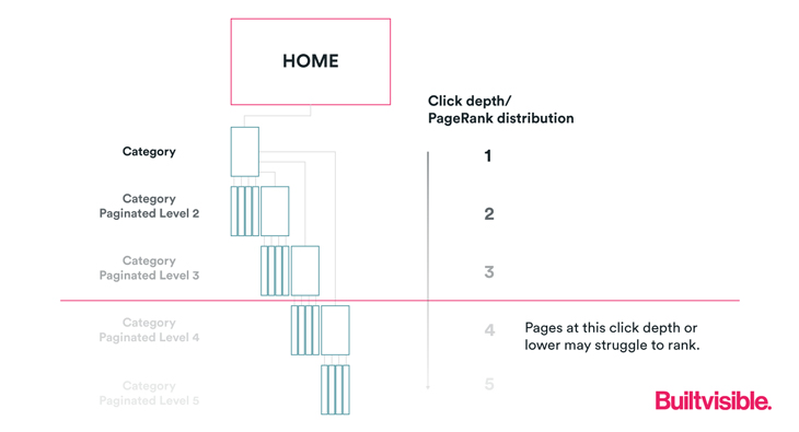
This kind of ever-increasing crawl depth (or click depth) means that many product pages end up with vanishingly small PageRank, which can indicate to Google that these pages are less important, affecting their crawl frequency and their ability to rank.
'Flattening' your site architecture is a method of dealing with this, which essentially means that you arrange your architecture to minimise the number of clicks it takes to reach your deepest levels of content.

(Image credit to the excellent Visualising SEO resource).
This should always be a prime consideration when building or redesigning a website, but it is also something that can be retro-fitted, through other navigation options like 'shop by style,' featured products, related categories, trending searches, 'recently added,' etc…
Matthew says…
Navigation is the wayfinding system of your website. Users need to quickly determine where they are and where they can go next. It needs to be laid out logically, hierarchically, and anticipate your user's needs. Good information architects will complete many card sorting exercises during the user research phase of a project to guide their navigation design. Good navigation benefits users that traverse your website in a linear fashion, meaning that they start at the home page to find the content they're looking for.
However, a large portion of user traffic comes from search engines. This is non-linear traffic. Users are plopped down onto a specific page of your website hoping to find what they are searching for. Even with this type of traffic, users need to quickly be able to find what they are looking for (see structured data in this article for more on this), determine where they are currently located, and where they can go next. Steve Krug refers to this concept in "Don't Make Me Think" as the Trunk Test.
There are three main types of navigation in traditional websites - main, sidebar, and footer.
I'll use a grocery store example to illustrate main and sidebar navigation. You visit another city for the first time and hit up an unfamiliar grocery store chain for picnic supplies. You first orient yourself to the store layout and then search the aisle signage to determine where the type of product you're looking for would be housed. From the head of the aisle, you scan the shelves to find the general area you're looking for and then you look at the actual shelves searching for your specific product by name, brand colors, logo, or even container shape to find it. Once completed, you may walk through random aisles to see if there's something interesting that you may not have considered.
Users interact with your primary navigation in very much the same way, so your website's accessibility should be built on these same premises. The user needs to be able to quickly understand the navigation, quickly move through the navigation, and have confidence that the navigation is describing what they will find. If they are enjoying the experience they may stay on your site and peruse other areas of the content. Users with disabilities do not have unique goals when it comes to navigation, however they do rely heavily on navigation to get them where they need to be quickly and accurately.
The footer, our third navigation type, is a catch all of useful items that the user often finds useful but are of secondary importance. Items like social media icons, contact information, notices such as legal and privacy, awards and certificates, newsletter sign-ups, etc. Users generally look for sitemaps and accessibility statements in the footer.
Good navigation helps everyone while also helping your SEO. Invest the time to get it right – and resist the impulse to just wedge things into it over time as it will quickly lose its usefulness. Better yet, make it a priority to test and redesign your navigation on a regular basis.
With these foundations established, let's build on them:
- Main navigation is also referred to as primary navigation and header navigation. It should be persistent and located at the top of every website page.
- Main navigation should be universal; do not change it as the user traverses the experience.
- All items in main navigation should be clickable.
- Use clear language. It should inform the user of what to expect if they select it.
- Place navigation in a meaningful and/or hierarchical order. Card sorting can help you see how to organize it in the best way.
- Consistency is critical; names, patterns, identification, page layout, iconography, etc. Consistent Navigation is also a WCAG Success Criteria.
- Anchor text rules should be applied to side and footer navigation as well. Be sure to read the anchor text section below.
- Accessibility statements are usually linked from the website’s footer.
- Breadcrumbs and sitemaps are additional types of navigation and are a great way for users to see and interact with your information. (Check out the Sitemaps and Breadcrumbs section later in this article.)
- Writers, content specialists, UX designers, product owners, information architects, and SEO experts should work collaboratively on navigation.
Section summary
Information architecture (IA) is an enormously important consideration when designing a website, in order for it to be understandable. IA should always inform and govern the website navigation, which exists to help users find information and functionality. Since it exists primarily as a facet of user experience, this should be the driving force behind design decisions, however, ignore SEO at your peril. Of all the things we cover in this article, navigation is probably the one you need to be most careful about when striking a balance between UX and SEO considerations.
Anchor text
Patrick says…
Another important factor when it comes to links, anchor text is the visible, 'clickable' characters and words that hyperlinks display. By using descriptive anchor text, you can indicate to search engines what sort of content to expect when they visit the linked URL - this can help them understand the context of the target page a little better.
Descriptive, keyword rich anchor text in backlinks from external domains can be a powerful factor for search engines during ranking, but often these sort of links are from 3rd parties and therefore difficult to control with precision.
Internal links, however, are a different matter - as you have full control over what anchor text is used. The general advice is, wherever possible, to use descriptive text that helps the user understand what content to expect on the target page.
Consider the example below, and internal link to a page about auditing accessibility on a website;
The anchor text of 'Read More' is ineffective at communicating meaning, either to a website visitor or a search engine.
It remains long-standing advice from Google to use descriptive anchor text, as it is 'a useful signal to help search engines and users alike to better understand your content.'
In this case, an example of descriptive anchor text would be something like this:
Matthew says…
This topic fascinates me. Why do we continue to see website and email teams using 'click here' or 'read more' links? Everywhere I look I see teachers and experts telling us over and over again to kick this habit. Yet, I still visit websites and receive marketing emails with 'click here!' Anchor text is a far better and more accessible option.
Anchor text are the words within the content that are hyperlinked to another destination. It should clearly state to the user what they will find at the other side of that click. The linked text should not interrupt the flow as the user consumes the content; it should be contextual.
This code: <a href="http://www.example.com">Example Anchor Text</a> first defines the target link and then the anchor text which appears as Example Anchor Text within the content. When the user clicks on the link it takes them to the targeted destination.
Screen reader and keyboard-only users can tab from link to link. When they do this, it's important to know that they aren't consuming the text prior or after the link itself. They are presented with just the anchor text. Given that these users don't have the context of the content surrounding the link, it's critical that the anchor text be clearly understandable on its own. It should be unambiguous, descriptive and aligned with the target destination's topic.
Good anchor text isn't solely for accessibility – it supports SEO too. Well-crafted link text helps search engines understand what a site is about, helps place value on pages being linked to, and helps with crawling, promotion and engagement.
Some additional points to keep in mind:
- Anchor text is the appropriate name for these more common terms: link, text links, descriptive links, and destination links.
- External and internal links should follow the same methodology. In general terms, this applies to navigation as well; see more in the navigation section of this article.
- Links should look like links: underlined and using a different color that has a 3:1 color contrast.
- Similar anchor text should not link to different destinations. For example, if you use 'Deque' in multiple locations and you need to link the word more than once, every linked instance should be taken to the same destination.
- Apply these rules of thumb consistently throughout the digital property, including in navigation.
- Writers, editors, content specialists, UX designers, and SEO experts should work collaboratively on anchor text. Social media teams, CMS authors, developers, QA/testers all need to understand the proper formatting techniques.
- More information can be found in the WCAG Success Criteria: Providing link text that describes the purpose of a link for anchor elements and Link Purpose (In Context): Understanding SC 2.4.4.
Section summary
Internal link optimization is a powerful, yet oft-underutilized practice for on-site SEO. Since you can be in full control when making on-site changes, you can choose precisely the anchor text variations you wish to be associated with each page. The fact that using descriptive anchor text on links is also a boon for web accessibility means it should be a foundational element to any website development or optimization strategy.
Image alt text
Patrick says...
The importance of image alt text for SEO is twofold:
- To help search engines understand the meaning and context of an image for the purpose of ranking in image search
- To perform the function of anchor text when an image is used as a link (i.e. a special case of anchor text)
This is because search engines are significantly better at understanding the meaning of text content than they are of images. By describing what an image shows through the use of alt text, this enables search engines to better understand what the image depicts and how it relates to the rest of the content on the page.
Alt text should describe the image and be sufficiently specific regarding the subject of the image and the context in which it appears. Unless you are working with a site that derives a high proportion of organic traffic from image search, there's no need to overthink alt text from an SEO perspective.
Google's own advice is to create 'useful, information-rich content that uses keywords appropriately and is in context of the content of the page;'

Matthew says…
Images communicate 60,000 times faster than text. From a user experience perspective, you can't overlook how impactful an image can be. As we mentioned previously in this series, users skim content; images are a big enabler for this practice. Is the user correctly interpreting what you're trying to communicate with that image?
Having said that, images should be used thoughtfully and with great care. They should not be the sole means of communication. You need a clear content plan and messaging. Images should be used to amplify the message. The information provided by the image should already be given in the adjacent text.
The context of the image also plays a huge part in communicating the message: models looking left versus right. Staircases that rise in the image versus descending stairs. Models that are smiling when the content is about a very serious or negative subject. Model inclusivity or bias. All of these differences can affect how the content is understood, perceived or contextualized by the reader.
Now, imagine you are actively seeking the image that will heavily contribute to your communication model — but some readers cannot see it: Maybe they have images turned off. Maybe they are on a slow network and images have not been loaded. Maybe the image hasn't been coded properly to provide an accurate description to a screen reader user. Can the user get the same level of understanding when the image can't be seen?
Some additional important aspects to keep in mind:
- Alt text is the term for what a screen reader conveys to its user about an image. If the alt text is blank, nothing will be announced. This creates a poor user experience; some screen readers will even read the image's file names instead.
- If the alt text is poorly constructed, the screen reader user may not understand what you want to convey.
- Keep alt content under 250-characters in length to minimize 'clutter' for screen reader users.
- A decorative image attribute should be applied in visual styling (like borders or padding to make a larger clickable area) for objects that are 'eye candy' only.
- Do not include 'image of' or 'picture of' as part of the alt content.
- Avoid excessive punctuation and emoticons.
- Do not stuff alt text with keywords.
Ensure that you are defining good content that conveys the main point you are trying to communicate with the image. A great example is to imagine you're in a meeting and the big boss is showing a very detailed slide with tons of information on it. They quickly say, 'Profits are up 500%' and then move onto the next slide. Wouldn't it be clearer if they just had a big call out with that number adjacent to the graphic? – Two clear, simple ways of communicating the message at the same time?
This would hit audience members who are more audio-learners and those that are visual or information-based learners. Wouldn't they be more confident that the audience really understood the point being made on that slide? Won't people that were having spotty audio understand the message even though they couldn't hear it? Wouldn't it also be more likely that someone seeing the slide later would quickly understand the point? Now, if the alt text conveyed just that key point instead of 'complex diagram with colored lines showing the results of this year's revenue and expenses,' screen reader users could easily understand the point of the slide.
Automated accessibility testing tools scan for the image label, look to see if there is an alt [text] attribute, and then a value within that alt text. They cannot determine if that alt text content is accurate, of quality, or provides appropriate context for the image. Only a human being can do that. This is where manual testing is critical. Assistive technologies like JAWS or NVDA must be used for this task.
The bottom line is that alt text helps both human users and bots better understand the meaning and context of an image. A great example of this: See how NASA uses alt text in this tweet to describe the amazing celestial images captured by the James Webb Telescope. Better yet, search on articles related to the discussions around, and reactions to, what an incredible job NASA is doing.
With these foundations established, let's build on them:
- Some interchangeable terms for alt text include alt tags, alt attribute, text equivalents, and text alternatives.
NOTE: Alt text is not the same as captions; they have different rules and requirements. - This concept applies to more than images; it should be considered for any non-text content such as CAPTCHA, animations, etc.
NOTE: we touch on video under the Content section of this article. - Read the tutorial from the Web Accessibility Initiative on how to use decorative images.
- Alt text is displayed to a user when an image does not load. This communicates the image's intent to users that turn images off and/or are having internet bandwidth issues.
- Writers, editors, content specialists, UX designers, and SEO experts should work collaboratively on alt text content. Social media teams, CMS authors, developers, QA/ testers all need to understand the proper coding and testing techniques.
- Remember to complete automated AND manual accessibility testing with assistive technology.
Section summary
Image alt text has been a basic requirement for on-page SEO for so long that I expect many people have forgotten what they are doing it for in the first place. Taking an accessibility-first approach to alt text means putting the user first, and, importantly, simultaneously satisfying SEO requirements.
Sitemaps…and breadcrumbs
Patrick says...
When we discuss sitemaps in the context of SEO, we normally mean XML Sitemaps. HTML Sitemaps can provide some value to search engines when it comes to URL discovery, and there are certain cases where you might recommend one, but typically HTML Sitemaps are a bigger benefit to UX than they are to SEO.
The logic behind this is really that Google should not need to rely on a HTML sitemap to find your pages!
However, this does not mean that they always can! As we discussed in the navigation section above, you should try to find ways to flatten your site architecture to minimise click depth, and there's no reason why an HTML Sitemap cannot help with this endeavour.
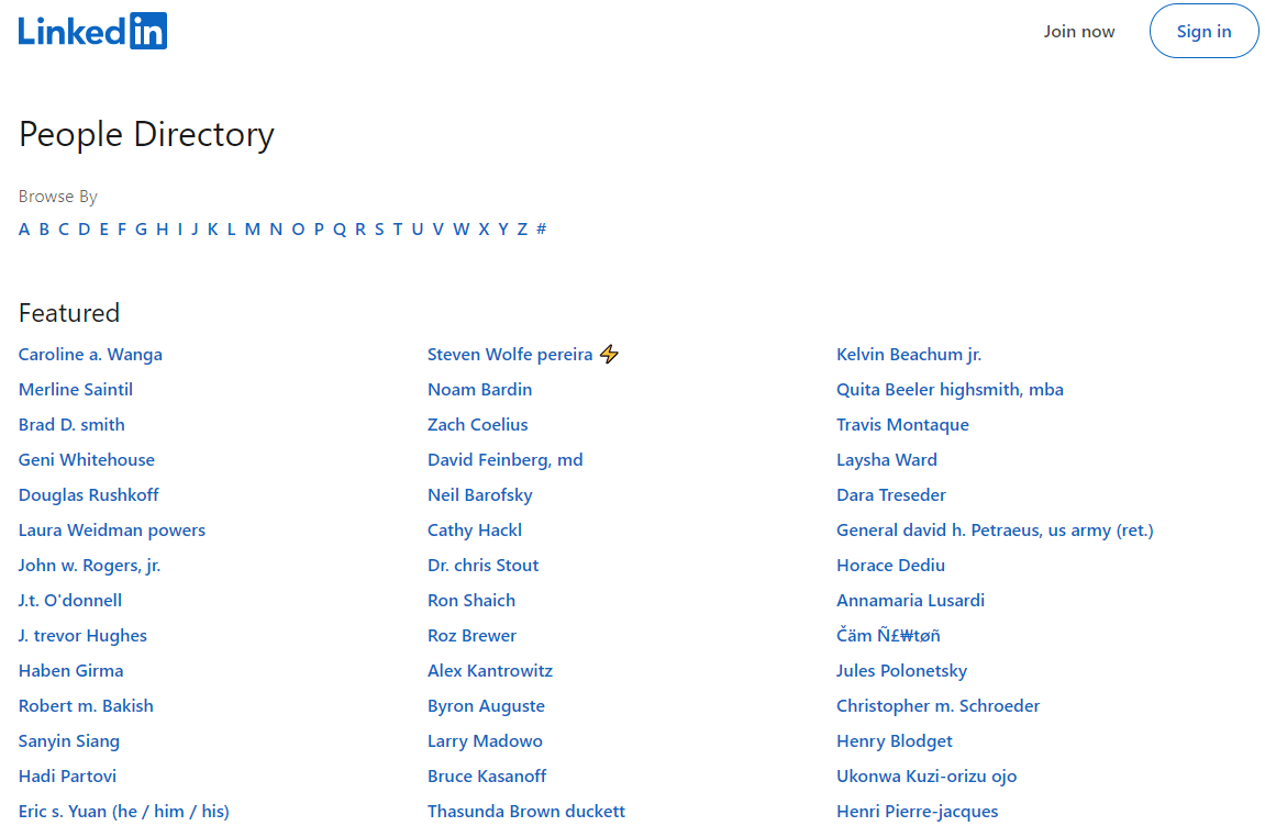
As Eli Schqartz points out in his SEJ post '7 Reasons Why An HTML Sitemap Is Still A Must-Have,' sites like LinkedIn make use of a HTML Sitemap to list out all of their millions of user pages.
Breadcrumbs provide another way of reinforcing your internal linking practices, while also being extremely beneficial as a navigation aid for users.
By including text-based internal links back up to parent pages, this helps ensure that internal link equity does not dissipate from category and sub-category pages, whilst also allowing you to optimize the anchor text used.
To make the most of breadcrumbs, make sure to mark up your pages with Breadcrumb structured data.
Breadcrumbs can also have the effect of reducing bounce rate - consider the example below:

If you landed on this result directly from the SERPs, but quickly realised you were not interested in this product, the breadcrumbs provide a 'way out' and enable you to look at other options on the website, without necessarily going back to the search results.
Google is also keen to communicate the hierarchy of a given page within a website in their search results, whether or not you use breadcrumbs.
For example, on the Sitebulb site we use breadcrumbs for our 'Hints' content, but not for our 'Guides' content. In both cases, Google will show a page hierarchy - using the Breadcrumbs when they are present, and the URL folder structure when they are not:
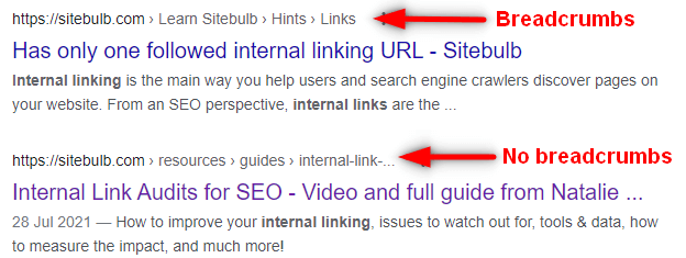
When breadcrumbs are not used, the result is less optimized - they are all in lowercase, and the final breadcrumb is truncated.
Finally, and perhaps most importantly, breadcrumbs enable you to explicitly communicate website hierarchy to search engines - which can help them understand the relative importance of different pages on the website, the relationships between these pages, and the wider context of the different topics covered on the site.
Matthew says…
HTML sitemaps and breadcrumbs are beneficial for keyboard and assistive technology users as they help them navigate better than main navigation. As a reminder, main navigation does not link to every page of content whereas sitemaps include an inventory of all pages.
If users can't find what they are looking for after viewing your site's main navigation, they will most likely look for an HTML sitemap to locate it. Some users even start their journey there. The fact that they can't find what they're looking for in the main nav could be related to your information architecture. Sitemaps can also be helpful to people with cognitive difficulties as it allows them to focus on specific text without other distracting content or interactivity.
Continuously update your sitemap when you add new web content. This will help search crawlers find and index the content much quicker as well as ensure that missed or ignored pages are represented, helping with SEO. Accurate Sitemaps assist users that prefer this method of navigation.
In ecommerce websites, breadcrumbs allow users to speedily navigate through more granular information than the main navigation provides. Breadcrumbs are also a more efficient way to get back to previously viewed pages. This can be applied to other types of websites to allow users a way to quickly drill down into deeper information.
Sitemaps (XML and HTML) are foundational assets necessary to the success of your website. There is a direct correlation between SEO and a site's accessibility when it comes to sitemaps.
With these foundations established, let's build on them:
- Breadcrumbs and sitemaps are types of navigation and are a great way for users to see and interact with your information architecture. Ensure you check out the Navigation section of this article.
- Main navigation is also referred to as primary navigation and header navigation.
- Sitemaps are traditionally linked in the website's footer navigation.
- Breadcrumbs and most navigation should follow anchor text guidelines.
- Breadcrumbs are a way to meet WCAG 2.1 AAA Success Criteria 2.4.8: Location.
- Most content management systems (CMS) have plugins that create and automatically update a sitemap.
- Information architects and SEO experts should work collaboratively on sitemaps. Writers, editors, content specialists, UX designers, and SEO experts should work collaboratively on breadcrumbs. In both cases, CMS developers and authors, developers, QA/testers all need to understand the methodology and testing techniques.
Section summary
Both HTML Sitemaps and breadcrumbs are primarily designed to enhance the user experience, providing alternative paths for the user who can't find what they are looking for through other means. They also serve to help communicate the structure of the website and work as signposts, so both users and search engines better understand how your site is organized.
Structured data
Patrick says...
Structured data is playing an increasingly important role in Google’s search results, as they are one of the main ways you can unlock ‘rich results’ for pages on your site.
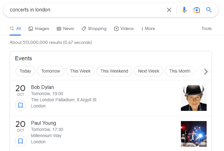
Utilising structured data markup can make pages on your site eligible for inclusion in search features like the one above, so they can be a powerful way to claim more real estate in the SERPs.
Of course, lots of sites don't have 'Events' like this, but almost every site can benefit from one of the many search features that Google support in their search gallery, and they are constantly rolling out new features, like the new 'Site name' label that now gets added to mobile results.
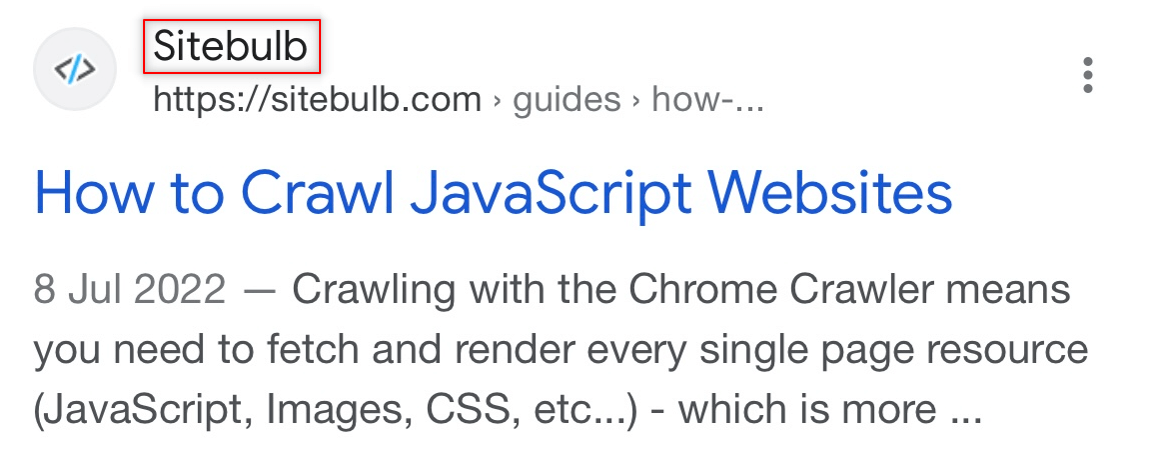
Google use a number of sources from a site's homepage to automatically determine the site name, including:
- WebSite structured data
- Content in <title> elements
- Heading elements, such as <h1> elements
- og:site_name
You can help improve the quality of the site name that's displayed for your page by adding WebSite structured data.
But search features like these really only represent the tip of the iceberg. As SEOs we spend so much time and effort trying to communicate the meaning and context of our content to search engines. Structured data allows us to do this in a standardized, explicit fashion; in Google's own words:
"Google Search works hard to understand the content of a page. You can help us by providing explicit clues about the meaning of a page to Google by including structured data on the page. Structured data is a standardized format for providing information about a page and classifying the page content."
Beyond search features themselves, embracing structured data is about providing digital content in a machine-readable format that allows computers to build semantic links between entities such that they can understand how the different entities relate to one another.
'Linked data' was one of the true goals of The Semantic Web, as I explain in my article 'Node Identifiers: From Structured Data to Linked Data.'
"The Semantic Web isn't just about putting data on the web. It is about making links, so that a person or machine can explore the web of data. With linked data, when you have some of it, you can find other, related, data."
Tim Berners-Lee, Linked Data - Design Issues
By using structured data we can unambiguously identify different entities and the relationships that tie entities together across multiple different web pages and multiple different web properties.
Matthew says…
Data structuring and schema directly assist SEO, and aspects of this benefit accessibility. Here, we will focus on the value structured headings and language contribute to accessibility.
Headings
Headings are used to break up content so that it is easier to consume. Readers glancing down the page quickly scan the text that is designed to stand out. When they find a section of interest they slow their reading to absorb the relevant information. Proper use of headings improves the user experience for everyone because they clearly categorize the content that follows.
Screen reader users navigate pages by headings to quickly find relevant content. They rely on semantic HTML tags (like H1 and Title) to accurately describe the content being presented. When the user finds the appropriate header, they have the screen reader read out the associated content.
Heading levels go from H1 through H6. A website page should only have one H1 tag defined. This is the main heading. From here, the content is broken down into smaller parts: H2 for sections, H3 for sub-sections, H4 for sub sub-sections, etc. Headings should be used sequentially, none should be skipped. For example, you should not have a page that contains H1, H2 and H4 with no H3 heading. A screen reader user could assume that they missed something if one header is skipped.
In word processing software, headings will automatically adjust the visual treatment wherever they are applied. Web designers should apply the same type of concept so that the visual treatment of headings is applied consistently from page to page. Designers that break up content only through visually type treatments, like bolding titles and indenting sections of text, are not creating hierarchical rules for all users.
We spoke earlier of breadcrumbs being a subset of navigation. We can also apply them to data structuring. Breadcrumbs quickly show readers how the data is defined one tier up above the page level. Make sure that you read the section about sitemaps and breadcrumbs in this article. We also spoke of title tags, these are a critical part of data structuring and schema. Ensure you have checked out that section as well.
Language
Every web page must define its main language. Screen readers can "speak" various languages. Some screen readers can even be set to access only websites in the user's pre-defined language.
Content should follow patterns and, not surprisingly, should not be boring. Engaging content that follows predictable patterns benefits SEO and accessibility. More importantly, it helps the user. Readability decreases and cognitive load increases when content doesn't follow set patterns. The user's ability to skim and quickly find what they're looking for suffers. With each negative experience, the likelihood of them revisiting your website diminishes.
With these foundations established, let's build on them:
- Use clear and descriptive headings.
- Establish heading hierarchy before design. Don't start writing the content or start development without having established the headings structure.
- Design artifacts and content documents should both have headings listed to make it easier for developers.
- Only one H1 per page.
- Do not skip heading levels.
- WCAG Success Criterion 1.3.1: Info and Relationships ensures that formatting is preserved when the presentation format changes, such as when consumed by a screen reader.
- Remember to define the primary language of every website page.
- Pay close attention to language definitions on sites where users can change the content to another language en masse.
- Writers, editors, content specialists, UX designers, and Visual designers should work collaboratively on headings. CMS authors, developers, and QA/testers all need to understand the proper coding and testing techniques.
Section summary
As covered in our second article, the way that HTML data is structured and semantically marked up makes a huge difference to screen reader users - proper formatting and structure rules are anticipated by other systems and therefore should be followed. Schema.org and structured data dive deeper into the standardization of data in a machine-readable format, presenting numerous opportunities to enable search engines to better understand your website content.
Google is forever building and developing its knowledge graph, which reflects how it understands things, people or places in the real (non-digital) world. It does this by taking both structured and unstructured data and mapping these together to try and form a coherent frame of reference on the overall information. Marking up website content with structured data is a way to take a measure of control by intentionally defining the relationships for them.
Summary
The items covered in this article merely scratch the surface - there is much much more to SEO and much much more to accessibility than we were able to cover here. However, the specific tactics discussed serve to illustrate the overlap between SEO and accessibility, and what things you should try to consider when building out website optimization recommendations. Understanding not just that they help the SEO, but also the accessibility of your website, can encourage a more holistic approach to website development and optimization.
There are still more overlaps between accessibility and SEO to showcase in the final part of this blog series. Up next, we will share where things are going, what's next and offer some thoughts on voice technology. Stay tuned for the final article in our 4-part series, and don't forget to also read Matthew's counterpart article over on Deque!
About Matthew
Matthew Luken is a Vice President & Principal Strategy Consultant at Deque Systems, Inc. For the four years prior to Deque, Matthew built out U.S. Bank's enterprise-level Digital Accessibility program. He grew the team from two contractor positions to an overall team of ~75 consultants and leaders providing accessibility design reviews, automated / manual / compliance testing services, defect remediation consultation, and documentation / creation of best practices. In this program there were 1,500+ implementations of Axe Auditor and almost 4,000 implementations of Deque University and Axe DevTools. Also, Matthew was Head of UXDesign's Accessibility Center of Practice where he was responsible for creating seamless procedures and processes that support the digital accessibility team's mission & objectives while dovetailing into the company's other Center of Practices like DEI, employee-facing services, Risk & Compliance, etc. He and his team's work has been recognized by American Banker, Forrester, Business Journal, and The Banker. In his user experience and service design backgrounds, Matthew has worked with over 275 brands around the world covering every vertical and category. He continues to teach User Experience, Service Design and Digital Accessibility at the college-level, as well as mentor new digital designers through several different mentorship programs around the USA.
About Deque Systems
Deque (pronounced dee-cue) is a web accessibility software and services company, and our mission is Digital Equality. We believe everyone, regardless of their ability, should have equal access to the information, services, applications, and everything else on the web.
We work with enterprise-level businesses and organizations to ensure that their sites and mobile apps are accessible. Installed in 475,000+ browsers and with 5,000+ audit projects completed, Deque is the industry standard.
