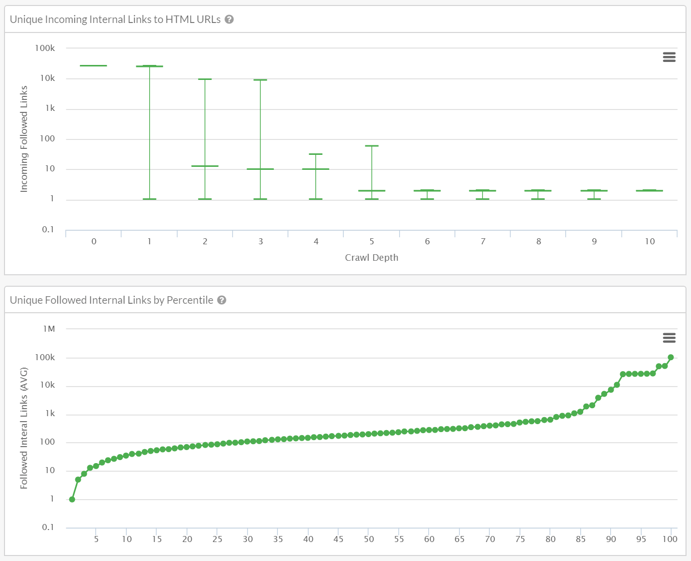
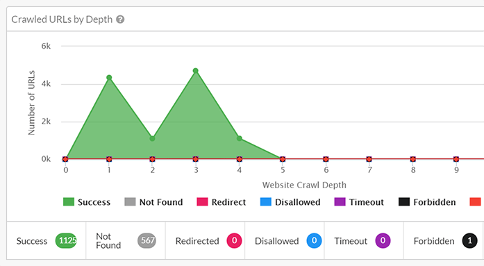
Interactive visualizations: drill down into the data
The point of a website audit is typically to first understand any issues or opportunities a website may have, and then to try and explain these to any relevant stakeholders. Graphical visualizations are perfect for communicating broader trends, as they can unlock patterns that were otherwise obscured within the raw data. Sitebulb’s extensive graphs will help you uncover meanings more quickly, and give you an easy way to communicate these in a report or presentation.


