Content does not size correctly to viewport
This means that the URL in question is not responsive, and the page content does not size accordingly when the screen size is changed.
Why is this important?
The browser's viewport is the area of the window in which web content can be seen. The viewport varies with the device, and will be smaller on a mobile phone than on a computer screen. A <meta> viewport element gives the browser instructions on how to control the page's dimensions and scaling.
When the screen is made smaller or larger than the viewport width, the content should re-size to fit, on responsive webpages. If this does not happen, then the page is not responsive and is not optimized for mobile devices.
Please note that this is not an issue if a separate mobile version of the page is set up.
What does the Hint check?
This Hint will trigger for any internal URL which contains page content that is either smaller or larger in width than the defined viewport width.
Examples that trigger this Hint:
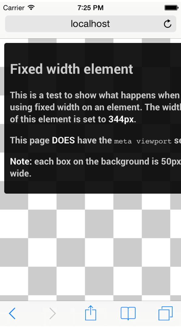
Consider a device with a width of 320 CSS pixels, such as an iPhone. If a page contains large absolute CSS widths for page elements (such as the example below, with an element set to 344px wide), this would cause the div to be too wide for the viewport, and cause the user to scroll.

How do you resolve this issue?
In the example above, the situation could have been avoided by using a relative width value, such as width: 100%. Similarly, beware of using large absolute positioning values that may cause the element to fall outside the viewport on small screens.
As a more general solution, you can look to use CSS media queries to help make your pages responsive. Media queries are simple filters that can be applied to CSS styles. They make it easy to change styles based on the characteristics of the device rendering the content, including the display type, width, height, orientation, and even resolution.
Media queries enable you to create a responsive experience where specific styles are applied to small screens, large screens, and anywhere in between. The media query syntax allows for the creation of rules that can be applied depending on device characteristics. You can read more about using CSS media queries for responsive design here.